News: Cracker Barrel just dropped its beloved barrel-leaning figure.
BY STRENG AGENCY, PUBLISHED AUG 22, 2025, 12:22pm EST
THE BREAKDOWN
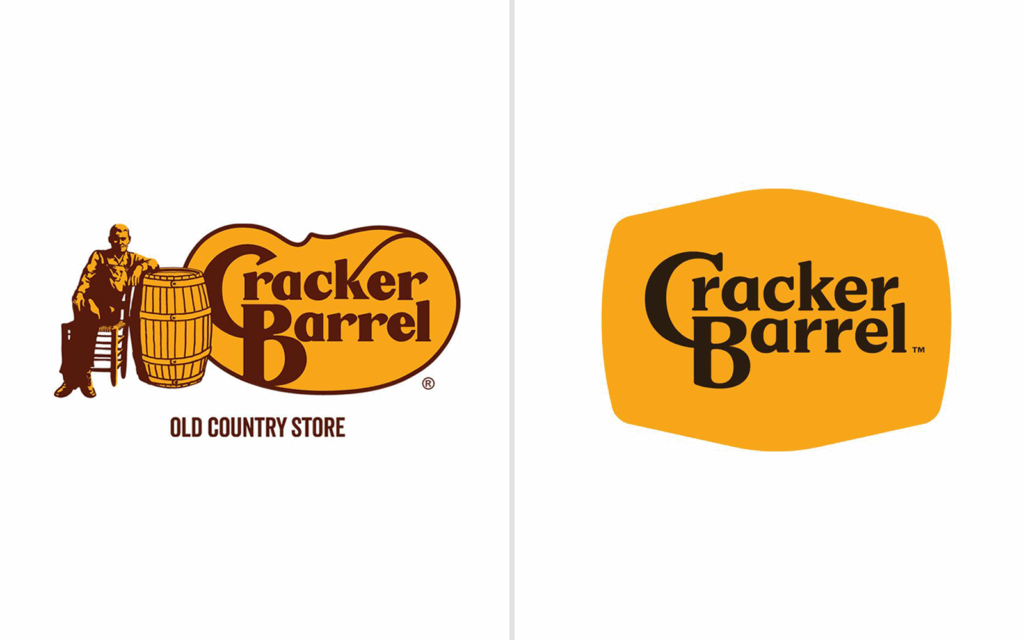
Cracker Barrel just dropped its beloved barrel-leaning figure for a minimalist, text-only logo. This is creating conversation across the industry. Has the charm been lost, or is this a refreshing reboot?
Logo simplification has been a trend for years, with brands chasing scalability and digital clarity. But for a restaurant like Cracker Barrel, the rustic imagery was more than decoration, it was identity. Without it, they risk losing emotional connection with longtime customers.
THE FULL STORY
Cracker Barrel’s logo refresh has become a flashpoint because it represents a bigger challenge many heritage brands face: how to modernize without losing the identity that made them iconic. The shift to a cleaner, text-only mark is consistent with the broader trend of simplifying logos for digital scalability, but for Cracker Barrel, the rustic imagery was never just decoration. It carried the emotional weight of tradition, comfort, and familiarity.
For younger audiences, the new design may feel fresh, minimal, and aligned with contemporary aesthetics. But longtime customers see the loss of the barrel-leaning figure as a departure from the soul of the brand. That divide is already playing out publicly, with backlash across social channels and a reported 10% dip in the company’s stock.
Ultimately, the redesign is less about a single logo and more about the broader challenge every legacy brand faces: balancing nostalgia with modern relevance. For Cracker Barrel, the answer will likely depend on whether new audiences embrace the streamlined look as fresh and inviting while longtime loyalists still feel connected to its roots.
VOICES FROM BOTH SIDES
As The Washington Post noted, many critics described the new logo as “sterile” and “soulless,” arguing the redesign abandons much of its nostalgic Americana appeal. While Cracker Barrel’s CMO, Sarah Moore, emphasized, “Our story hasn’t changed. Our values haven’t changed. With ‘All the More,’ we’re honoring our legacy while bringing fresh energy, thoughtful craftsmanship and heartfelt hospitality to our guests this fall.”
While Moore stood by the redesign, she later acknowledged the backlash, noting that “despite the criticism, we remain committed to listening to our guests and making sure they feel the same warmth and hospitality that have defined Cracker Barrel for decades.” In other words, the company is signaling that while the visuals may evolve, the core customer experience is intended to remain the anchor.
LEGACY ON THE LINE
The Cracker Barrel redesign highlights a familiar crossroads for legacy brands: balancing the comfort of nostalgia with the demands of modern branding. While the backlash is real and may continue to sting in the short term history shows that audiences can and do adapt. Automakers like Kia and Volkswagen initially faced skepticism when they shed their older logos, but both rebrands are now widely recognized as sleek, future-facing updates that strengthened brand relevance.
For Cracker Barrel, the question isn’t just whether customers will get used to a new logo. It’s whether the brand can reinforce the same warmth, identity, and storytelling that kept generations of diners coming back. If it succeeds, the redesign may eventually be remembered not as a departure, but as a bridge into its next chapter.