BY STRENG AGENCY, PUBLISHED OCT 24, 2025, 9:00am EST
GOOD HABITS, GREAT IDEAS Being creative often means being chained to your desk. But your brain isn’t a machine—it needs fuel. Step away from the screen. Take a walk. Eat something that’s not just caffeine. Sleep at least 7 hours. Move your body. When you neglect yourself, you neglect your creativity.
ENERGY MAPPING Notice when and where your energy is at its best. That’s your peak creative time, protect it. Align your work with your “why” so you’re creating with intention, not just forcing output.
DIP INTO A DIFFERENT MEDIA Designer? Try clay. Musician? Snap some photos. Painter? Write a story. It’s not about being good—it’s about shaking your brain out of autopilot. Creativity feeds on variety. The messier, the better.
TREAT YOUR WORKSPACE AS YOUR TEMPLE Picture this: you’re in a white padded cell with a laptop, easel, guitar – or whatever your creative tools are. Four blank walls pressing in. Could you create? Maybe. Would you lose your mind first? Definitely. Don’t let your workspace feel like that. Make it alive, make it yours, make it inspiring.
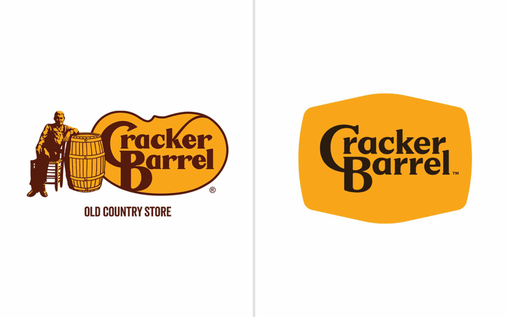
News: Cracker Barrel just dropped its beloved barrel-leaning figure.
BY STRENG AGENCY, PUBLISHED AUG 22, 2025, 12:22pm EST
THE BREAKDOWN Cracker Barrel just dropped its beloved barrel-leaning figure for a minimalist, text-only logo. This is creating conversation across the industry. Has the charm been lost, or is this a refreshing reboot?
Logo simplification has been a trend for years, with brands chasing scalability and digital clarity. But for a restaurant like Cracker Barrel, the rustic imagery was more than decoration, it was identity. Without it, they risk losing emotional connection with longtime customers.
THE FULL STORY Cracker Barrel’s logo refresh has become a flashpoint because it represents a bigger challenge many heritage brands face: how to modernize without losing the identity that made them iconic. The shift to a cleaner, text-only mark is consistent with the broader trend of simplifying logos for digital scalability, but for Cracker Barrel, the rustic imagery was never just decoration. It carried the emotional weight of tradition, comfort, and familiarity.
For younger audiences, the new design may feel fresh, minimal, and aligned with contemporary aesthetics. But longtime customers see the loss of the barrel-leaning figure as a departure from the soul of the brand. That divide is already playing out publicly, with backlash across social channels and a reported 10% dip in the company’s stock.
Ultimately, the redesign is less about a single logo and more about the broader challenge every legacy brand faces: balancing nostalgia with modern relevance. For Cracker Barrel, the answer will likely depend on whether new audiences embrace the streamlined look as fresh and inviting while longtime loyalists still feel connected to its roots.
VOICES FROM BOTH SIDES As The Washington Post noted, many critics described the new logo as “sterile” and “soulless,” arguing the redesign abandons much of its nostalgic Americana appeal. While Cracker Barrel’s CMO, Sarah Moore, emphasized, “Our story hasn’t changed. Our values haven’t changed. With ‘All the More,’ we’re honoring our legacy while bringing fresh energy, thoughtful craftsmanship and heartfelt hospitality to our guests this fall.”
While Moore stood by the redesign, she later acknowledged the backlash, noting that “despite the criticism, we remain committed to listening to our guests and making sure they feel the same warmth and hospitality that have defined Cracker Barrel for decades.” In other words, the company is signaling that while the visuals may evolve, the core customer experience is intended to remain the anchor.
LEGACY ON THE LINE The Cracker Barrel redesign highlights a familiar crossroads for legacy brands: balancing the comfort of nostalgia with the demands of modern branding. While the backlash is real and may continue to sting in the short term history shows that audiences can and do adapt. Automakers like Kia and Volkswagen initially faced skepticism when they shed their older logos, but both rebrands are now widely recognized as sleek, future-facing updates that strengthened brand relevance.
For Cracker Barrel, the question isn’t just whether customers will get used to a new logo. It’s whether the brand can reinforce the same warmth, identity, and storytelling that kept generations of diners coming back. If it succeeds, the redesign may eventually be remembered not as a departure, but as a bridge into its next chapter.
Bring Ullman into the 21st century. Start from the ground up and develop an entirely new marketing & communication strategy that would serve to transition every aspect of the company and impact every touchpoint with its growing distribution network. Oh, and do this all in 60 days!
THE CHALLENGE
Bring Ullman into the 21st century. Start from the ground up and develop an entirely new marketing & communication strategy that would serve to transition every aspect of the company and impact every touchpoint with its growing distribution network. Oh, and do this all in 60 days!
“The plan of attack was to re-tool the brand mark and create a tagline and content roadmap that would drive product messaging for the distributors as well as the end users.”
The game plan was to simply focus our attention on the idea that Ullman had been an excellent device engineering company for many years and their relationship with distributors was in good shape. What we needed to do now was give the brand a facelift and create a communication tactical plan that would truly represent the company for many years to come. The plan of attack was to re-tool the brand mark and create a tagline and content roadmap that would drive product messaging for the distributors as well as the end users. We created a contemporary mark that was a better representation of the company’s dedication to “Professional, Durable, Engineered for Success” newly created tagline. The attitude became a rallying cry for the company and an emotive direction for the brand – a shared bond that reignited the relationship between Ullman and its distributor base.
Retooling a brand is a little like reinventing the wheel. Some would say simple, some would say hard, either way it impacts everything it comes in contact with.
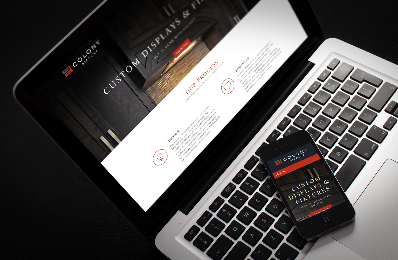
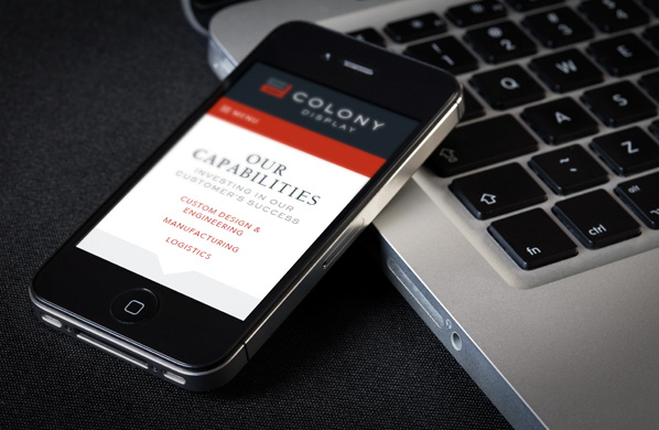
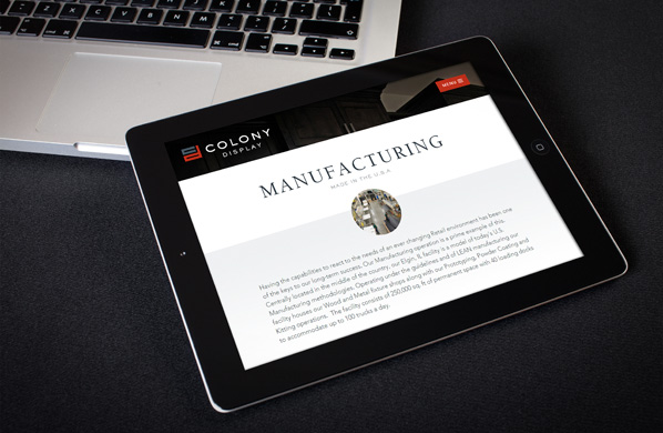
Website wireframes were essential to establishing an intuitive user experience.
Ah, the collateral touchpoints, where the rubber meets the road. The consumer at this point has an unbridled interaction with the brand.
Ah, the collateral touchpoints, where the rubber meets the road. The consumer at this point has an unbridled interaction with the brand.
OUR RESULTS
Initial new product sales are through the roof. Fourth quarter 2018 sales of the three new products launched at the show are exceeding expectations. The Ullman Distributor base has flooded the microsite and corporate headquarters in Chicago with new product requests. Initial sales for the new items has consumed all initial product production and 1st quarter 2019 is looking as though it will do the same.
Retooling a brand is a little like reinventing the wheel. Some would say simple, some would say hard, either way it impacts everything it comes in contact with.
Website wireframes were essential to establishing an intuitive user experience.
Ullman proudly took home two of AAPEX’s Best Booth Awards in 2018. Booths were judged on a combination of design and interaction.
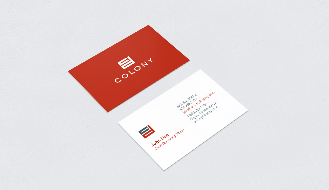
Dugan & Lopatka, CPA’s is a regional accounting firm based in Wheaton, Illinois, established in 1974. In 2018 several senior members of the partnership, who had been with the firm since its inception, were nearing retirement and a younger partner group was to take over management of the firm, directing it into a new era. One of the decisions agreed upon by the new management team was to move its offices from its current home of more than four decades, to a location to more conveniently benefit both its business clients and employees. With the new management of the firm and the move to a new location, the firm also looked to take this opportunity to refresh its brand.
THE CHALLENGE
Our challenge was to take a tired, dated brand and refresh it with a new identity that reflected the new opportunities awaiting Dugan & Lopatka, its management team and employees, and conveying this new beginning to their business clients.
“We helped Dugan & Lopatka tell their story through a bold new identity and a completely refreshed visual brand.”
THE SOLUTION
Beginning with a redesigned firm logo mark, we completely redesigned many of the firm’s marketing collateral materials ensuring a consistent use of new branding colors. Redesigned materials also included a new corporate folder, letterhead stationery, business cards, office signage and banners, and templates for firm practice areas and accountant inserts.
Retooling a brand is a little like reinventing the wheel. Some would say simple, some would say hard, either way it impacts everything it comes in contact with.
THE RESULT
The business centric mark we designed for Dugan & Lopatka established a sophisticated, modern appeal. The angular appeal of the mark’s red block gave a reference to the opening of a door to new opportunity. The name treatment and use of the ampersand also gave the mark a statuesque feel that resonates with the business community. New signage and many of the marketing materials awaited the new management team and staff as they moved into their new corporate offices, adding to the excitement of the move. The redesign served to emphasize to clients and staff that the firm was embarking on an exciting new chapter in its corporate life.
For over 40 years, Huskie Tools has provided the utility industry with rugged and reliable hydraulic cutting and compression tools. Their battery-operated line is among the most accurate, efficient & sophisticated on the market. Good enough, right? Well not so much, the wolves were at the door, market share was shrinking, it was time to add market-changing products. Their answer, launch their new Series 7 line of Hydraulic Cutting & Compression tools which needed a new brand design and positioning as well as updates to the Huskie Tools brand. Simple, right?
THE CHALLENGE
They needed a logo, their new tools to be re-branded, the development of a brand identity that supported their new messaging to the utility professional and a slew of other marketing materials. So, refresh the brand mark, photograph the entire line of tools, brand the tool images, place them into multiple banners and assorted trade show materials, and create drop dead gorgeous collateral materials to be distributed at the show. And do all this within 60 days!!! Oh did I mention they didn’t have the tools on hand or even manufactured yet? So all photography had to be manipulated to simulate products that hadn’t yet arrived in the U.S.
OUR SOLUTION
We strategized, we pondered, we even wondered, and we created a strong, clean, bold, modern, industrial brand mark and brand structure that appealed to their rugged professional consumer base. We also carried it through all content and design executions: trade show brochures, individual product brochures, catalogs, web updates and email journey marketing. It was impressive, it was everywhere. And the consumer loved it.
THE RESULT
Trade show attendance was up. Focus groups loved the products. The utility industry ultimately loved the products as well! We did our job, they looked like a million dollars to the entire utility industry and their competitors - of which there are many - like Greenly and Milwaukee Tool. The wolves were kept at bay!
John B. Sanfilippo & Son, Inc. (JBSS) is a publicly traded corporation located in Elgin, Illinois. As the dominant processor, packager, marketer, and distributor of nut and dried fruit based products their market presence is realized on a global platform. Their products are sold under a variety of brands like Fisher Nuts, Orchard Valley Harvest, and Sunshine Country. Our challenge was to create a new and fresh corporate parent website that would replace their older website and create a trustworthy user experience that built upon the existing brand. The goal for the website was to bring the look and feel of the JBSS brand to the web while creating an informative and easy to navigate site. To make the content easier to digest, we simplified copy and focused on type pairings that make reading on the web much easier, and used large beautiful photos to engage the user and enhance the experience. The overall aesthetic was meant to convey a sense of tradition while inspiring trust. The end result showcases their wide range of products, along with providing valuable investor information and adherence to regulatory compliance guidelines.
BAB Systems, the national franchiser of Big Apple Bagels® asked us to create and launch its first ever national advertising and marketing campaign. We completely redesigned their consumer facing website, in store menus, branding elements, directed photography, and developed their new tag lines. We also branded their new breakfast sandwiches, launched a national consumer sweepstakes, and created national sales events utilizing direct mail, print, and social media that helped raise the needles on franchise sales both regionally and nationally.
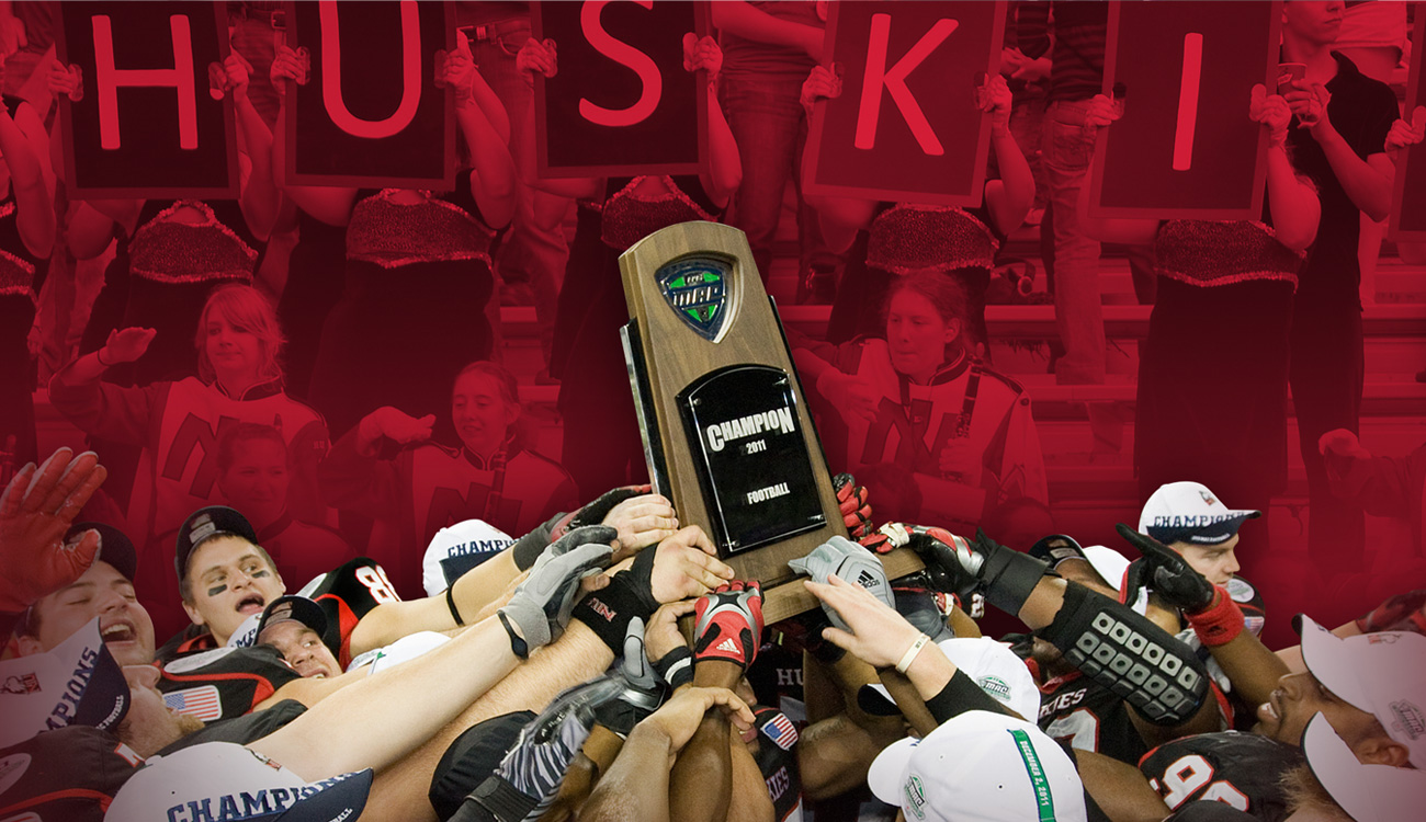
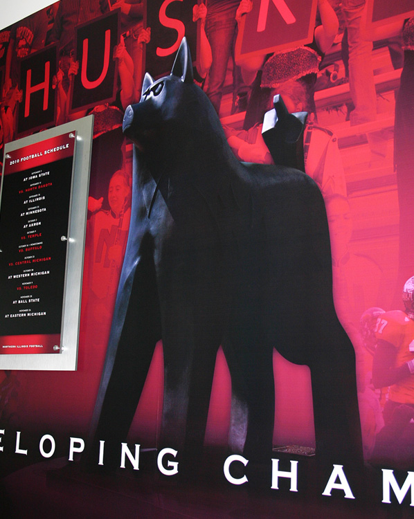
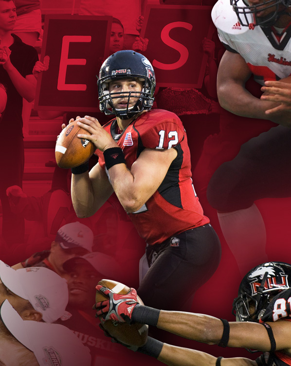
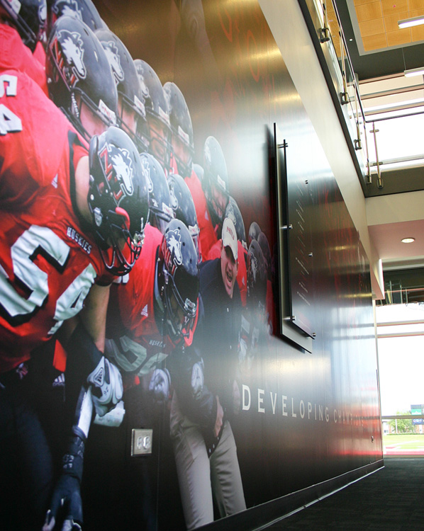
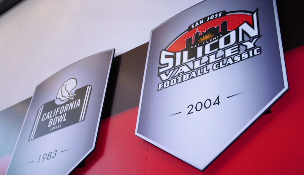
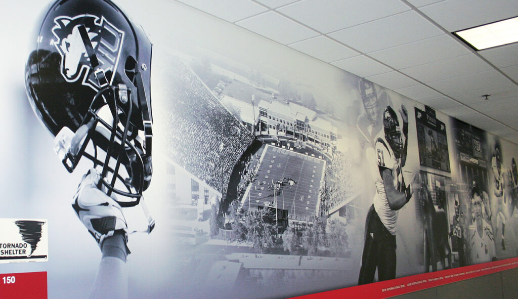
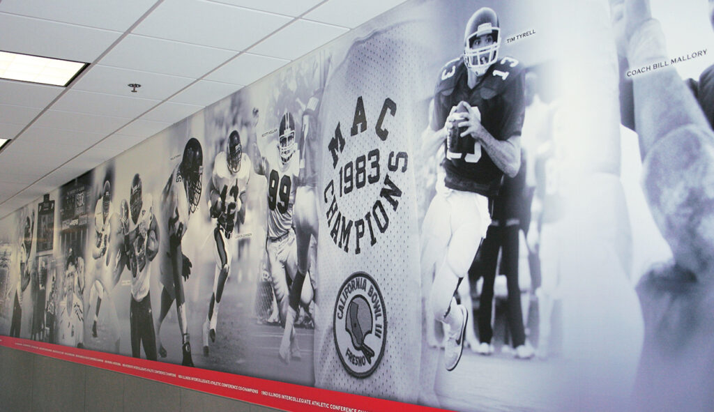
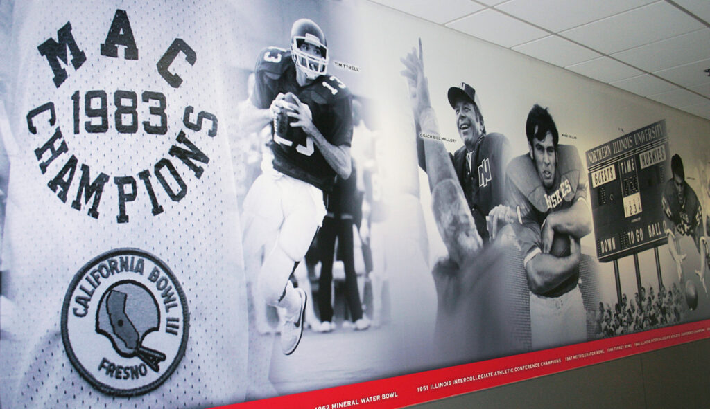
Working with volumes of archival imagery, we rebuilt the Hall of Fame from the ground up, in an expandable format that will continue to evolve along with the growing list of NIU’s sports heroes